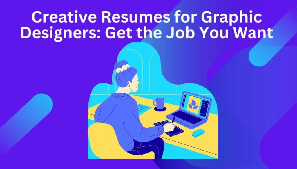
As a graphic designer, your resume is an extension of your brand. It’s your chance to display what you’ve done and how you think creatively. However, in the quest to stand out, many designers fall into the trap of sacrificing clarity for visual flair. This article isn’t about turning your resume into an artwork – it’s about finding the balance between impactful design and showcasing your critical skills.
When Does a Creative Resumes for a Graphic Designers Make Sense?
Before we dive into specifics, let’s discuss when taking a creative approach truly adds value:
- You’re targeting design-forward companies: Startups, ad agencies, or tech firms with a creative bent are likelier to appreciate a well-executed, unconventional resume.
- Your work demands visual communication: Web designers, UI/UX specialists, and graphic artists can significantly benefit from a resume demonstrating their action skills.
- You have a traditional backup: It’s wise to have a standard-format resume showcasing your core experience; you can tailor your approach based on the job.
Creative Doesn’t Mean Chaotic: Key Considerations
- Readability Rules: Design elements should enhance, not obscure, the information a recruiter needs. A busy layout will likely ensure you never hear back.
- ATS Compatibility: Many companies use Applicant Tracking Systems. Fancy formatting and unusual fonts can sometimes hinder the software’s ability to read your information. Remember that it’s the interview where you can impress with a dazzling portfolio.
- Match your style to the role: A clean, minimalist resume with one bold typographic element can be stunning. Going “maximalist” works if it aligns with your portfolio and the company seems open to such an approach.
Design Strategies to Elevate Your Graphic Design Resume
- Strategic Infographics: A Cornerstone of Impactful Graphic Design Resumes. Consider these possibilities:
- Timeline of Experience: Visually appealing format compared to standard chronological bullet points. Highlight critical projects alongside dates.
- Skills Proficiency Chart: Instead of “Adobe Photoshop: Proficient”, create a small bar chart indicating experience levels for crucial software.
- “Client Success” Snippet: Use a simple but striking visual (like a pie chart) to showcase results delivered: “[Increased User Retention by 20%]”
- Limited, Meaningful Color: Color choice reveals design thinking:
- Monochrome & Accent: Modern, high-contrast. Choose an unexpected accent color that subtly ties into your portfolio.
- Analogous Palettes: Select two or three related shades for a sophisticated, calm effect. This approach works well for designers specializing in a specific niche.
- Complementary Contrast: High-energy pairing (orange/blue) creates vibrancy, use with restraint.
- White Space is Your Friend: A fundamental principle often overlooked by creatives on their resumes:
- Generous Margins: Create a relaxed feel and avoid a cramped look.
- Varying Line Spacing: Create a hierarchy, separating job titles from responsibilities with extra space.
- “Invisible Grid:” Align headings and blocks of text to make scanning easier.
- Testimonials as Design Elements: Showcase positive feedback strategically
- Pull-out Boxes: Short quotes in accent color boxes create visual breaks.
- Integrated Icons: Combine quotes with simple icons (stars, speech bubbles) for added interest.
- Testimonial Header: Place one impactful quote prominently as a subheading within a section highlighting relevant skills it supports.
- Interactive = Memorable: For digital applications, level up your game
- Resume Webpage: Build a simple site. Include work samples beyond what fits on a one-pager.
- QR Code: Link to your portfolio or online resume using a visually appealing QR code.
- Embedded Video: If videography is your forte, a short montage can be highly impactful, but do provide a static option as well.
Additional Considerations
- Typography Tells a Story: Choose two complementary fonts (heading vs. body). A subtle serif/sans-serif combination often works.
- Subtlety with Unconventionality: If opting for a multi-column layout or nontraditional heading placement, keep the design clean and intentional to avoid confusion.
- Physical Copy Matters: If handing in a printed resume, select a premium paper stock that shows off your color choices and feels pleasant to hold.
Design tricks can mask a need for more solid content. Don’t become so invested in the visual side that you overlook showcasing your top projects, experience, and achievements in precise, compelling wording.
Sample Skills Chart
- Heading: Software Proficiency
- Bars: List programs relevant to your specialty (Illustrator, Photoshop, InDesign, Figma, Sketch, etc.).
- Scale: A precise numerical scale is only sometimes necessary. Relative bar lengths representing levels like “Expert,” “Advanced,” “Intermediate,” and “Familiar” can suffice.
- Color: Select one or two shades that match your resume’s accent color scheme.
- Placement: This visual works great in a narrow sidebar for desktop applications or neatly below your “Skills” section. List the same items in text form nearby to ensure ATS compatibility.
Customization Tips
- Beyond Software: Create another chart focused on broader skills: “Branding,” “Typography,” “UI Design,” etc. This caters to recruiters and those less familiar with specific design programs.
- Show Growth: If space permits, use two sidebar graphs labelled “Past Proficiency” and “Current Proficiency. This shows commitment to personal growth.
- Pie Chart Alternative: Similar data could be presented as a divided circle. Be wary of too many small slices – legibility suffers if more than 5-6 skills are listed.
Building the Foundation: Content Still Matters
Creativity only works if the fundamentals are strong. Ensure these pieces are impeccable:
- Contact Info: Don’t over-stylize! Make it ultra-clear how to reach you.
- Clear Summary: State who you are (e.g., “UI/UX specialist with 5+ years…”) and your most significant strengths in 2-3 lines.
- Keywords: Research job boards for industry terms and naturally weave relevant ones throughout your resume.
- Proofreading: Design won’t save you from glaring typos! Get a second pair of eyes.
Creative Graphic Design Resume: An Example
Let’s consider a UI/UX designer with mid-level experience. This is one example – adapt it to showcase your strengths and style.
Overall Format & Approach
- Layout: Single column with content sections running vertically in a precise order. However, the left margin is generous, creating extra space for visual accents.
- Typography: The header is set in a bold, sans-serif font (e.g., Montserrat) for impact—body text in a smaller, simple-to-read sans-serif (e.g., Open Sans).
- Color Palette: Predominantly black and white for high readability. A single vibrant accent color (e.g., Teal) is used strategically.
Specific Elements
- Full Name & Title: At the top, your name is the focus in bolder font. Underneath, a one-line professional summary: “UI/UX Designer with 4+ years crafting intuitive website experiences.”
- Contact Info: Positioned in the upper left corner, discreet but with crystal-clear details (email, location, portfolio URL).
- Skills Chart: Small bar graph visually presenting relevant proficiency with Illustrator, Figma, Adobe XD, HTML/CSS. It is in the left margin adjacent to the “Skills” section.
- Experience: Job titles/companies in the central column. To the right, a short but impactful testimonial in a teal text box with precise sourcing – “Project Leader, ABC Tech.”
- Unique Element: A simple line drawing/icon with a UX focus (perhaps a sitemap or wireframe) placed near the resume’s top. This demonstrates visual thinking and reinforces your specialty.
- Optional: “Projects” Section: Include a few top work samples if space allows. Include only your role, client, and a concise 1-line achievement snapshot (e.g. “Redesigned UI, increasing conversion rate by 15%”)
Additional Tips
- Tailor to Each Application: You may have several creative and standard versions.
- Test on Different Devices: Ensure your resume looks great on every screen.
- Get Feedback: Solicit the opinions of peers and those with an eye for great design.
Conclusion
A creative resume can propel your job search by making you a memorable candidate. But, design with a solid foundation and a focus on what recruiters need will get you far. Combine these factors for a resume that’s both impactful and practical.